Even while you are teaching kids to crunch numbers, you also need to keep track of your own numbers. But how can you make the accounting a pleasant experience for primary schools? The Dutch company behind this case was rebuilding it’s accountancy application.
As the developers behind this platform were rewriting all the necessary software behind the platform, they approached us for a redesign of their existing platform.
The Challenge: Redesign Tabular Data
The existing platform was lacking in certain key aspects. First, some elements were not logical in their use or were placed at illogical places.
As
The Solution
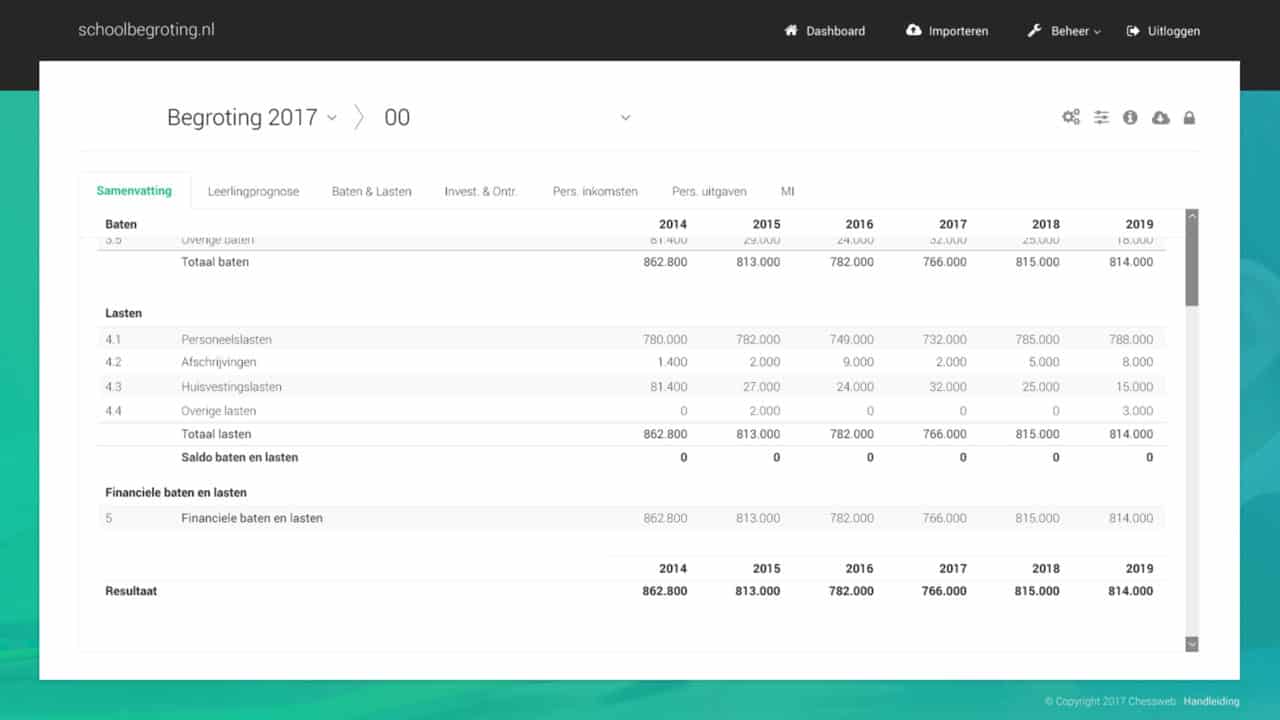
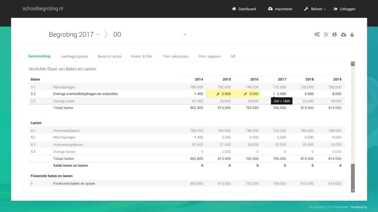
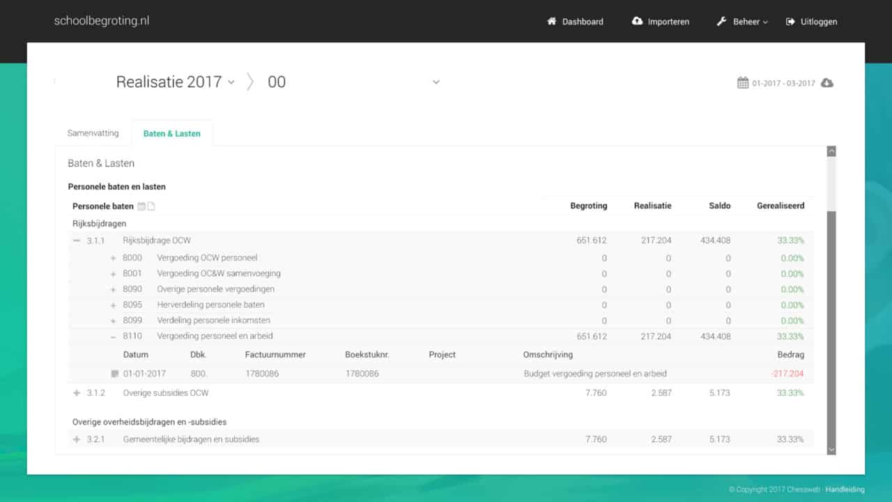
We started by analyzing the current design and finding the core weaknesses. We also researched numerous sources on the visual design of tables for readability and implemented these findings in the design. This resulted in a completely revamped design with a focus on clarity.
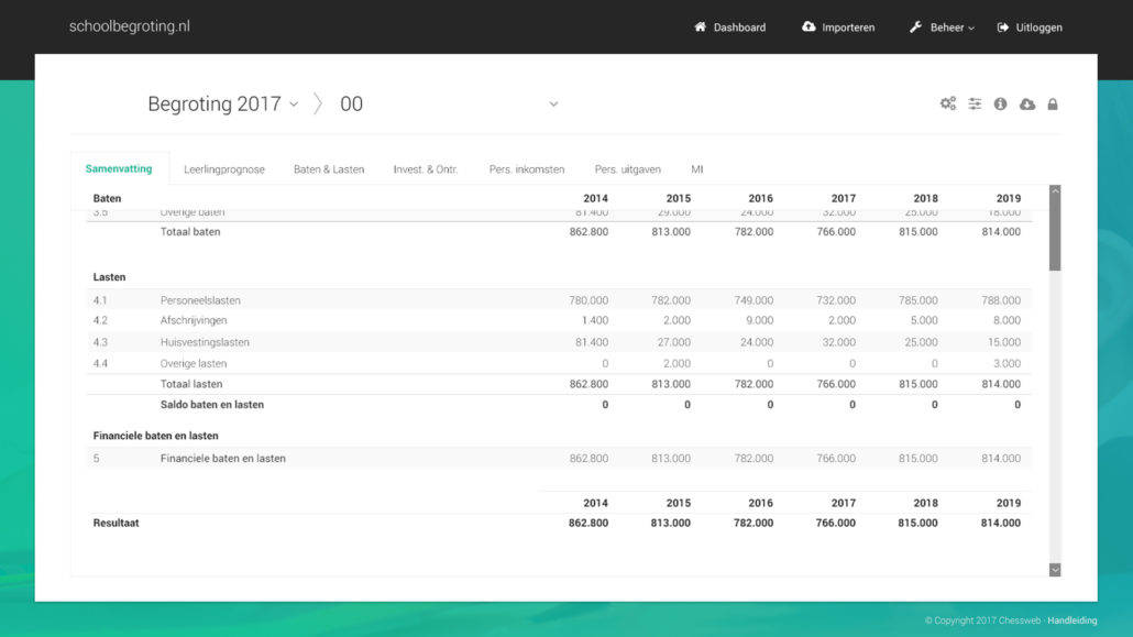
The settings screen for most editing actions was completely hauled over, and tables were redesigned. Using tables with an alternating background and enough whitespace results in optimal readability and improved the accounting experience for dozens of primary schools.

